
I had such a wonderful time working with Amanda from The Ginger Home on her new brand, website, and marketing materials! I absolutely adore how everything came together, and am so thrilled with the result!
Amanda reached out to me earlier this year, as she had quickly outgrown her previous website. She started her blog in 2018 as a small passion project, and created it using a simple website template, as she wasn’t quite ready to invest in a fully-custom website.
But, seeing as Amanda is so talented when it comes to home décor and DIY’s, her blog was a hit and took off! Which meant that she soon realized she was ready for a new website, to be able to take her brand and website to the next level!
Amanda’s Brand & Website Goals:
- Create a brand that’s striking and bold, but timeless and relatable – one that brought in modern elements with a English country farmhouse feel.
- Design a website that highlights all of Amanda’s stellar blog posts, is visually engaging (a.k.a. gorgeous!), and encourages users to spend time exploring!
- Make it easy for users to find what they’re looking for on Amanda’s website – whether that’s shopping her favourite home décor pieces, checking out her brand partnerships and working with Amanda, or reading the latest blog posts.
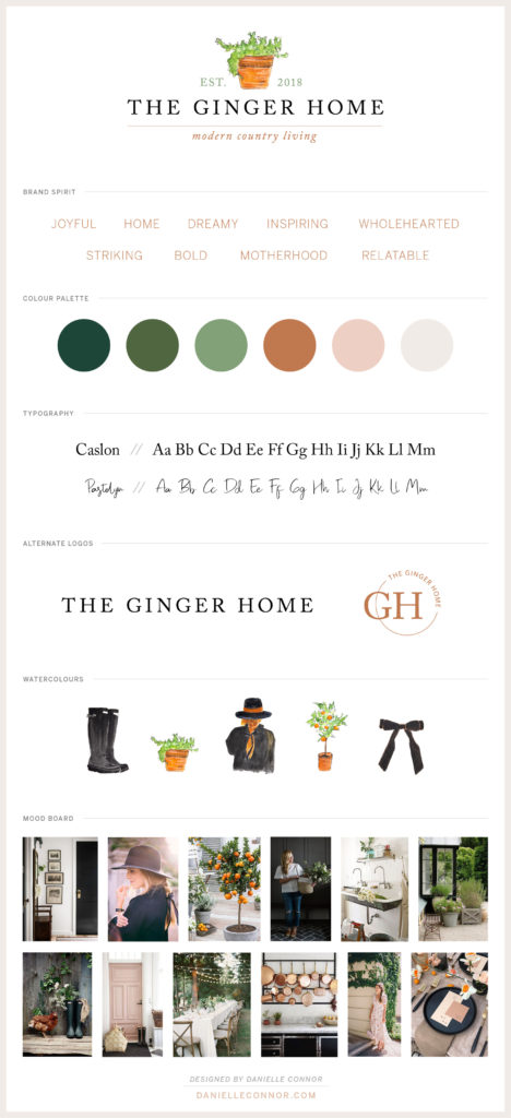
Amanda’s Brand + Logo
Amanda was after a modern yet traditional look, incorporating all her different styles into one beautiful brand that represented who she is and what The Ginger Home is.
After a few revisions getting everything just right, we created a brand that’s joyful, inspiring, bold, and wholehearted!
I love the earthy tones we used throughout, especially the beautiful ginger/copper colour (playing to the name of her blog – The Ginger Home – and Amanda’s gorgeous red locks!), which complement the warm olive greens, taupe, and blush perfectly.
When creating Amanda’s logo (and all my clients), I always give them a few different versions of their logo. You always want to have a handful of options to use in different instances. For example with Amanda, she had originally wanted a logo with her tagline, “Est.2018”, and a watercolour image.
She loved the logo that we created, but we realized it wasn’t the best fit for the main logo to use on the website. So we pared it down to just “The Ginger Home”, which looks clean, simple, and classic on her website. And then Amanda has the more intricate logo in her toolbox to use in other instances. Same as the logo icon, the “GH” – we included that in the footer of her website to add a fun little design element.
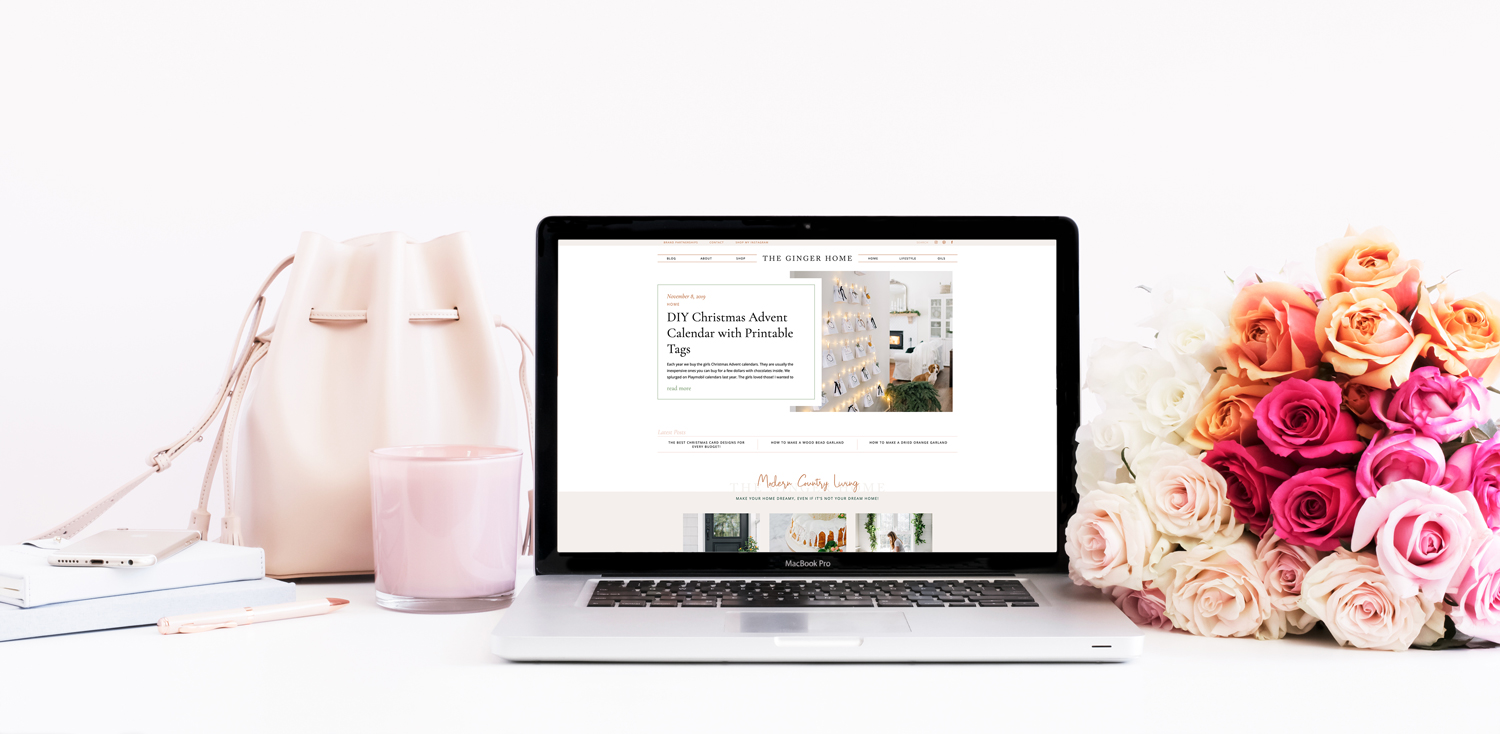
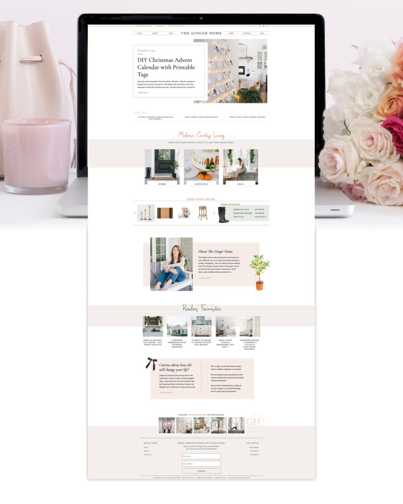
Amanda’s Website
Showit site number three! (Haha I promise I’ll stop keeping track now, but if you want to see Erin and Codi’s sites – number one and two – be sure to have a look!)
Again, it was so much fun creatively to create Amanda’s new blog for her, getting to bring together all these different elements together like the custom watercolours she had made, her new colour palette, and gorgeous photos!
Amanda’s old website was quite simple (as you can see below), so we really stepped it up with her new website, creating pages that keep users moving throughout her website pages, engaging with them in so many ways, both visually and interactively – something that her old website was missing.
The Before:
The After:
My Favourite Features of Amanda’s Site:
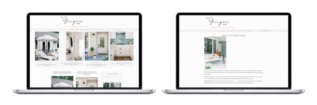
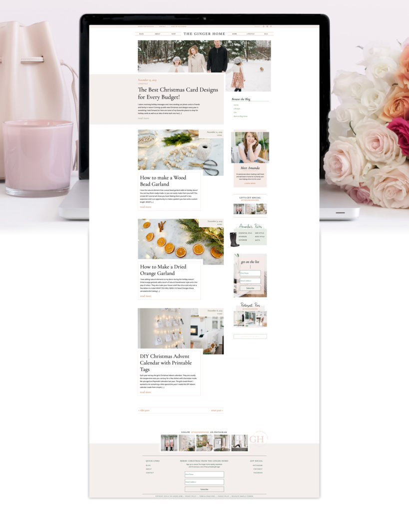
1. The Dropdowns in the Main Menu
A first for me, on Amanda’s site – we created these great little dropdowns under the “Home” and “Lifestyle” categories in the main menu. This makes it super easy for users to find exactly what they’re looking for, and explore Amanda’s blog with ease.
2. The Shop Section
Amanda’s got a great eye for décor and design, so we wanted a shop section to highlight all her favourite pieces! She had quite the array of categories, so we created a simple menu breaking everything down and making it fun and enjoyable for users to browse the different categories!
I love the top section of Amanda’s home page, where we feature the most recent blog post, and the three latest ones below that. It’s a different, fun way of showcasing posts as soon as user’s land on Amanda’s site.
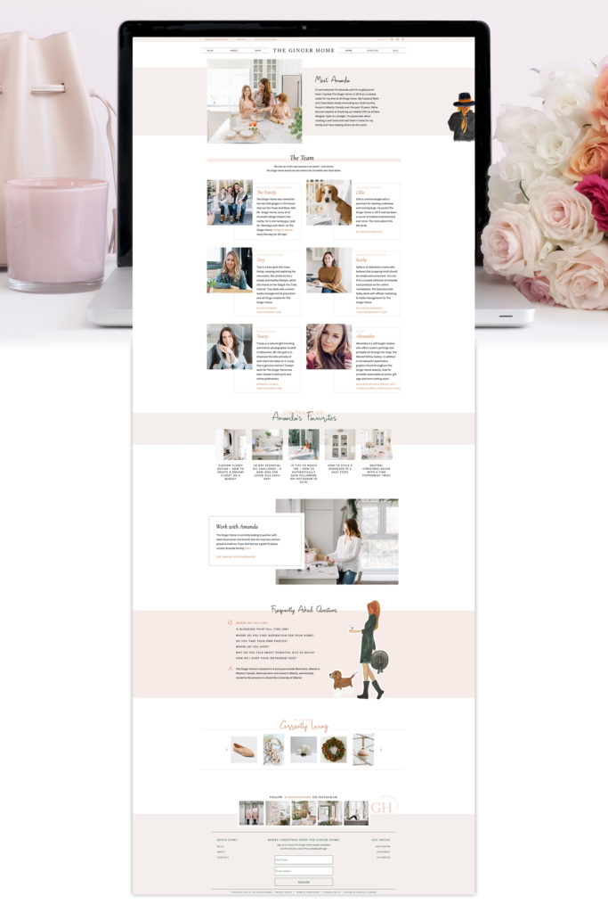
4. The FAQ section on the About page
I love a good FAQ section, especially because Showit makes it so easy to be super creative with these kinds of interactive sections! Amanda’s is so cute with the watercolour image of her, the large “Q” and “A” letters, and again the interactive nature of it!
“Working with Danielle was amazing! She really listened and respected my vision, while at the same time offering unique and creative ideas! Danielle was extremely detail oriented and efficient. She delivered on time and in a professional manner. And I couldn’t be happier with my new website! Both the aesthetics and the functionality are exactly what I envisioned. I would recommend any of Danielle’s branding or website services in a heartbeat!”
– Amanda, The Ginger Home
Be sure to take some time to go check out The Ginger Home’s new website – Amanda has some really fun Christmas posts up right now for the holidays!
I hope you enjoyed the little tour and behind-the-scenes of my branding and website project with Amanda! I love giving you guys a little extra how-to in hopes that it helps you when creating your own visual identity and website!
And if you’re looking for a little guidance in planning out a big project like this, make sure to check out this month’s freebie!
A branding and website project planning calendar!
I’ve broken down all the phases of a project like this with key milestones, to-do’s, and suggested timelines!

Let me know if you have any website or Showit questions below in the comments! I’d be happy to answer them!
XO
Danielle