I’ve been finishing up some amazing client projects, which I couldn’t be more excited about! I’m so thrilled with how they turned out!
And that got me thinking (in addition to a great conversation with a friend), that there may be a lot of things I do/think when designing a brand and website for a client that may not be so obvious to everyone else.
Which is why I want to share three of my insider branding secrets for when you’re creating your own visual identity! Here are some things that will help you as you bring your vision to life for you brand and website!
1 – Keep it simple
You don’t need to go crazy with colours, fonts, and design elements. I know it’s exciting, but it’ll start to look cluttered quickly, and you’re going to lose your audience’s attention.
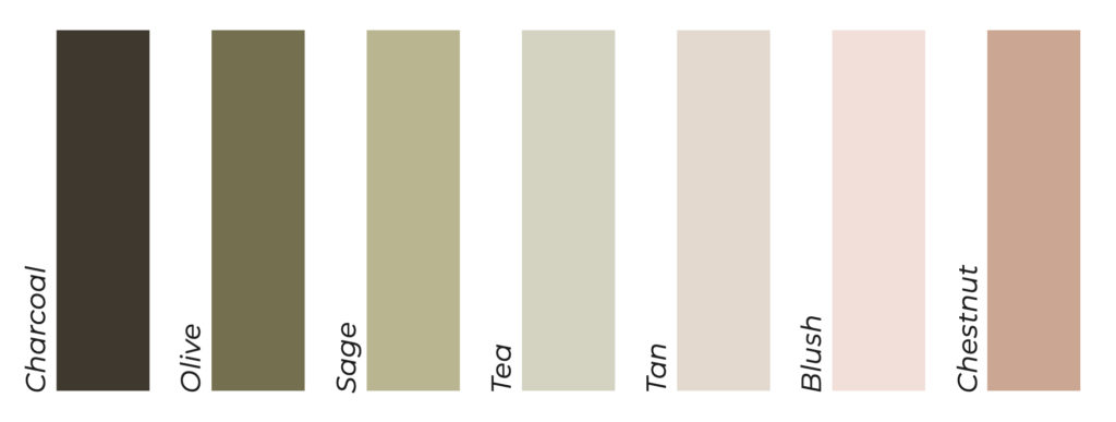
Especially if you’re DIY’ing your brand, less is more. With this colour palette below that I created for a client, we’ve stuck to earthy, neutral colours, which tie beautifully into her mood board and existing brand photography.
When it comes to colours, I usually suggest 2-3 main hues (in this example below we have greens and blush/neutrals), and then a few different shades of each.
Want some more tips to create your visual identity?
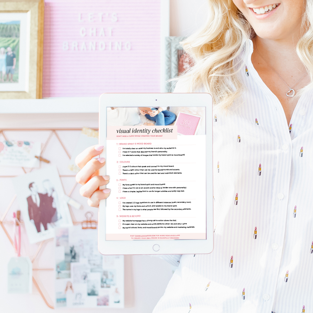
Grab a copy of your very own Visual Identity checklist! Filled with tips and tricks to picking your colours, fonts, mood board, and more?!

2 – Create hierarchy and have one star of the show
I’ve talked about having one star of the show when it comes to combining fonts, but it applies across your entire brand, especially any marketing materials you’re creating.
When you’re designing/creating your website, an Instagram graphic, or even an email, try to pick one main font/colour/element, and let everything support that.
For example, in this blog post, I have larger titles to separate these three tips, and that’s where reader’s eyes are drawn to first. Then I have photos, and then text to support the rest. On your website’s homepage, the start of the show would be a photo or tagline above the fold (what users see first, before they start scrolling down the page).
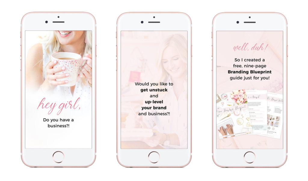
If you’re creating a graphic, think about which element people see first. What’s the biggest and most prominent? Is that what’s most important? In the example below, the text is what you see first, and in the last graphic, you see a photo of the freebie after reading the text.
I wouldn’t want the photos to take over, which is why I added a subtle pink overlay, so they serve as a background image. I want the text to stand out and be easily legible.

3 – Ask for feedback
I mentioned this in my email last week (if you’re not signed up yet, what are you waiting for – I share even more insider secrets weekly with my amazing email list!), and it’s something I do often!
Whether it’s showing my clients their branding drafts, running a design by a friend to get a second opinion, it can be so helpful! You get to a point where you’ve been staring at something for way too long, and it can be so useful to get a set of fresh eyes on whatever you’re working on.
There’s also nothing wrong with getting help and feedback! Whether that’s sharing a sneak peek on Instagram and getting people to weigh in, showing what you’re working on to a business bestie – we all need to ask for help and insights.
With that said, know how to ask for helpful, constructive feedback. There’s a time and a place to ask “Do you like this?”, but sometimes that can lead you astray, especially if you’re not asking people who are your ideal clients.
For example, if someone’s feedback is “I hate those colours”. Ask them why? Maybe they think the colours clash, or they’re too neon/bright for your calm wellness brand. Or maybe they just don’t love pink, but it’s your favourite colour and it connects with your audience. They may not be your ideal audience, and that’s okay!
Ready for some more insider design secrets?!
Make sure to get on the waitlist for my course, Blissfully Branded, as I’m opening enrollment in the new year! I’ll also be hosting a free branding masterclass to kick off the exciting week!
In Blissfully Branded, I’ll walk you through how to create your entire brand and visual identity. And you’ll get the opportunity to have 1-on-1 feedback from myself, and a Facebook group to get feedback and help from other students!
XO
Danielle

