I know that picking fonts for your brand and marketing materials can be tricky! How do you pick fonts that complement one another, but don’t overpower or compete with each other?
I love this part of the branding process, working with my clients to choose fonts that bring to life their brand identity, and showcase their business’ personality! I’ve long lost track of how many fonts I’ve looked at over the years, so I thought it would be fun to share a few foolproof font picking tips and tricks I’ve learned along the way!
So here are my foolproof font picking tricks for you to use when choosing your own brand fonts!
1. There can only be one star of the show.
Think of it like a cocktail party, too many strong personalities are going to clash. Pick one star of the show, and a second font that doesn’t compete with the star. A go-to example would be a bold serif or playful script as your star, and a simple sans-serif font (some great free ones are Raleway or Montserrat) as your secondary font.
2. What personality do your fonts evoke?
For example, are they playful? Elegant? Rough? Feminine? These personalities need to complement one another and be similar. You can’t have a rough, punk-style font with a soft, hand-written feminine font – they’re not going to work well together and look quite odd next to one another.
3. Are your fonts clear and legible?
It doesn’t matter how great your fonts are if people can’t read them. Usually, your “star of the show” is a more elaborate font (like that bold serif or playful script) and is used for titles and main text. Then your secondary, simpler font (like that sans-serif) will be for your body copy and longer paragraphs of text.
Examples of Do’s and Don’ts
Below is an example of two font pairings – one works and one doesn’t. Can you tell which one’s successful and which one isn’t?
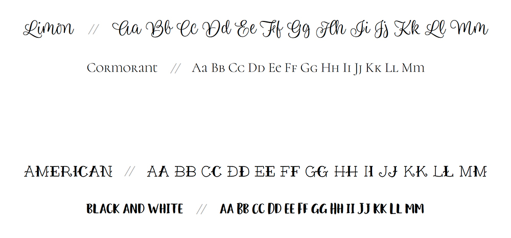
If you guessed that the bottom pairing doesn’t work – you’re right! The top pairing works great because the Limon font takes centre stage and Cormorant supports it.
In the bottom pairing, both fonts compete with one another. They both have too much personality and are trying to outshine one another. Lastly, neither font would be easily legible in a long paragraph of text.
Now this next example is a bit trickier, which pairing works and which one doesn’t?
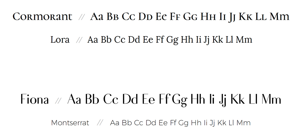
If you guessed that the top one doesn’t work – you’re right! Why? Because the fonts are too similar. They’re both serif fonts that get lost in one another.
Even though the bottom two are both sans-serif fonts, they’re different enough in weight, size, and style that the Fiona font takes centre stage, and Montserrat serves as a secondary font that complements Fiona.
Hope you enjoyed those foolproof font picking tips and tricks and you’re excited to try them yourself! Have fun picking fonts that showcase your brand’s personality and visual identity!
Not sure where to find your fonts? Here are few of my favourite websites to download and purchase fonts from:
Google Fonts
Creative Market
My Fonts
Happy font choosing!
XO
Danielle
P.S. Need some help? Check out my new brand audit service or branding packages if you’d like to work together to create your brand!
Ready to create your full brand identity now that you’ve chosen the perfect fonts?
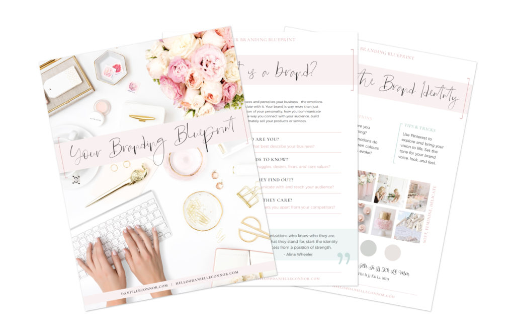
Get your free, nine-page Branding Blueprint workbook below!