
Today I’m sharing a website mistake you might be making that’s costing you leads, clients, and how to fix it! 👀
🥖 Now run, don’t walk to open your website, stand a baguette’s length away from the computer and scan your site for any text written in an accent font.
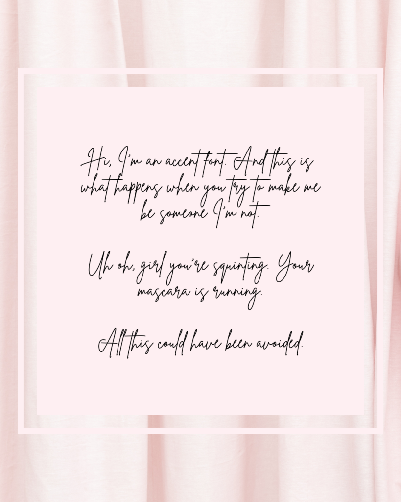
(Not sure what that means? Often accent fonts look like cursive, or anything dramatic and italicised.)
That, my girl, is an accent font and if you can’t read it from where you’re standing, then your leads can’t read it when they’re skimming your site.

Accent fonts are meant to be used sparingly! For a few key words here or there, to add some visual interest to your website. You NEVER want to use accent fonts for a paragraph of text, or even a long title.
If your leads can’t read it, it’s not convincing them to work with you which means your site isn’t doing her job.
Don’t worry!
If you’re using Showit it’s easy to change your font. (And that’s one more reason to switch to Showit!)
👩🏼💻 Here’s your quick fix:
Give your website a once-over and change any accent fonts that you can’t read! It doesn’t matter how “pretty” it is if your ideal clients don’t know what it says 😉
If you’re ready to up-level your brand and create a Million Dollar Website this year, let’s hop on a call and chat! 🙌🏻✨