You’ve done it – Congratulations! You’ve designed your own website but are now realizing you have very few call to actions and your potential clients have nowhere to go…
Don’t sweat! I’m here to walk you through all the ins and outs of website call to actions and how to best incorporate website call to actions into your website! So let’s get started with the basics!

What’s a call to action & why are they important?
A CTA is also known as a call to action. You’re calling your audience to take an action; whether that’s clicking through to a different page of your website, applying to work with you, or purchasing one of your products. Simply put, it’s the next steps you want your audience to take to get the end result.
I cannot stress the importance of call to actions. Call to actions are SO IMPORTANT because they’re what’s going to convert your audience into paying clients and customers. This is the “hook”, where you’re going to draw your audience in, get them excited, and make them want to take that action!
So, the best thing to do is make your call to actions irresistible and easy to click on! You want your future clients/customers to not even think twice when clicking on your call to action! The next step should be such a no-brainer that they take action.

When & Where to use Call To Actions on Your Website
Now that you know what a call to action is, I want to make sure you know where to use them on your website and are crystal clear on when to use them!
When your audience gets to the end of a webpage you never want to leave them hanging, that’s where the importance of the call to action comes in. If a person has to wonder what to do or where to go next, you’ve lost their attention and they’ll click away.
The majority of sections on your website should ideally have clear call to actions. Whether that’s taking your audience to your about page, to learn more about your services, or to get in touch. Be intentional about guiding them through your website. Think of the client’s journey and their experience on your website. Where did they come from? What might they be looking for? How can you make it easy and streamlined by using clear, strong call to actions to help them find what they’re looking for and ultimately book your services!
With that being said, there are a few exceptions to this. For example, if you have a services page with a testimonials section, that probably doesn’t need a call to action. Also, not every photo or video banner on your site needs a CTA. Maybe you just have a fun quote you’d like to highlight overlaid on the image instead.
Where to use a Call to Action on Your Website
The most important areas on your website to have a strong call to action are at the top of a page and at the bottom of a page. Especially at the bottom because you want your user to know where to go next when they are done reading that page.
A great example of this is if you have a services page where you outline your services, share testimonials, have FAQ’s, and then people get to the bottom of the page and there’s no “Book Now” button. Without that CTA button, you’re making it that much harder for people to work with you! And that’s not what we want. Remember, we want it to be a no-brainer for your ideal clients that they’re excited to click that button and work with you. So make it easy for them!
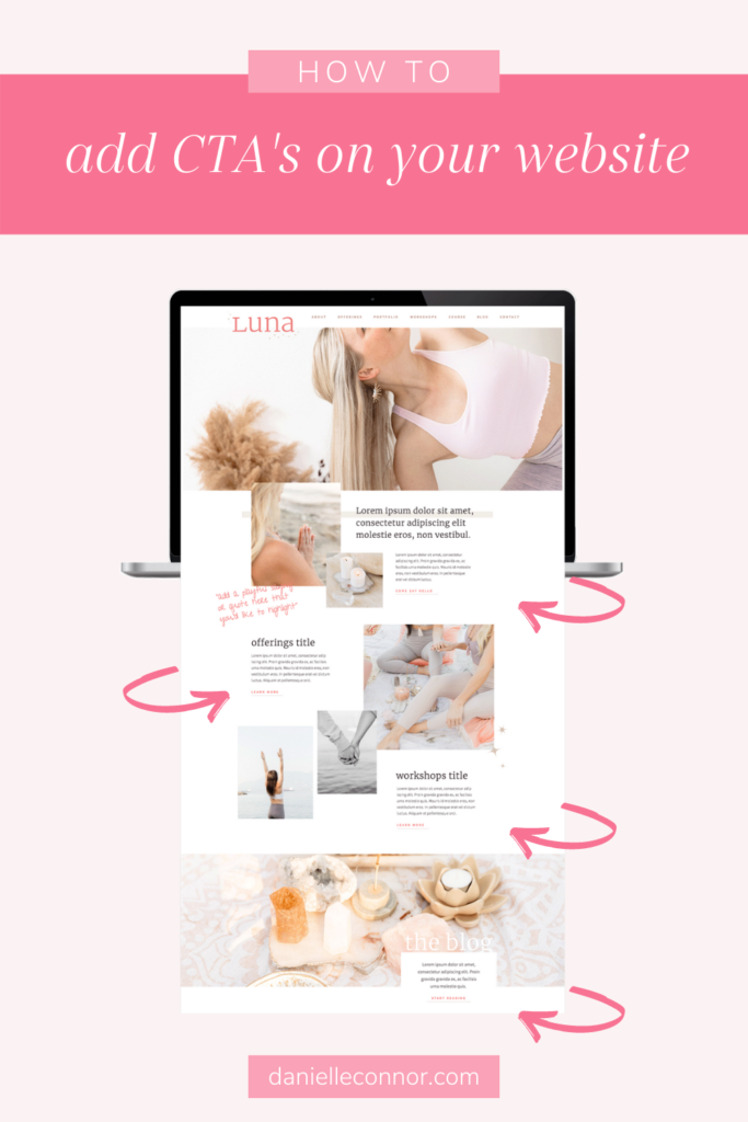
Check out some examples of how I incorporated call to actions for the Luna Showit website template here!

7 Call To Actions You Can Add To Your Website
Now that you are crystal clear on the ins and outs of the call to action, I want to share with you some of my favourite call to actions that you can easily add to your website today! This FREE list of call to actions is easy to add to your website and is great for service providers, photographers, creative entrepreneurs, coaches and virtually any online-based business!
Use these 7 CTA’s Below!
- I’m so ready – This is a fun one, and not only because I say these three words in real life all the time haha! What I love about this and something I recommend you try doing for all your call to actions is it’s an “I” statement. Make your audience feel like the button was made for them.
- Apply today – It’s clear, concise, there’s a sense of urgency by using the word “today” and people will get excited knowing they can start right away (even if you have a waitlist or are booking a few months out). It’s also great if you’re a service provider to have a button that says “apply”, as it helps your services stand out, and shows that you take on a limited amount of work to a select number of clients. This then allows you the ability to work more inline with your dream clients and brands that are the right fit for you.
- Book my free 15-min consult call – This helps if you don’t have an application form and offer short introductory calls. The idea is to provide clear, concise call to actions, with a personal statement. Your audience is booking their individual call.
- Get to know me! – This one works well obviously for an about page call to action, people are invited to get to know you better and ultimately learn more about you.
- Snag my “XYZ” freebie! – For any kind of downloads, I like something a little more playful and cheeky. That said you can totally go with a simple “Download my free guide today!” if that is more inline with your brand voice.
- YES! I want in! – This could be for a course or program, or something your audience is signing up for. A great way to get them excited about taking this next step!
- Find my perfect template! – You can replace “template” with anything you sell on your site, whether that’s a physical or digital product. Your audience will be excited knowing they’re only moments away from finding exactly what they’re looking for.
Are you a CTA & Branding Pro?
By now you are probably a call to action pro! So get on out there and start adding custom and unique calls to action to your website design! I can’t wait to see the beautiful designs you’ve made and hear the success you have with your calls to action!
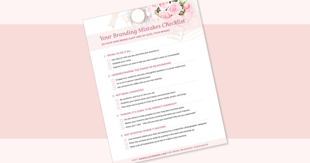
If you’re not feeling like quite a pro yet no worries! I’ve got you girl! Grab a copy of my branding mistakes checklist to make sure you are starting your website off with a solid brand!

Insider Call To Action Tips from a Website Designer
Let’s stop using “learn more” as call to actions.
I know you can do better than that! I’d encourage you to see where you can add personality to your website! Everything builds your brand and helps you connect with your dream clients – so have fun with it! Make it clear, specific, and add that special flair to it! I highly recommend taking every opportunity you can to add your brand personality to every ounce of your business and there is no need to skip out on adding some flair when it comes to call to actions.
Ultimately, clarity is key.
Yes, you want there to be personality, but don’t get too creative. If I don’t know where this call to action is going to take me, I’m going to be hesitant to click it, and that’s not what we want. We don’t want to seem spammy or threatening to our users so avoid anything that might deter them from clicking.
Call to actions = take action!
Call to actions are about taking ACTION, so make sure you’re inviting your audience to actually DO something. Don’t forget to use verbs to make it really clear what they’re doing when they click on that call to action.
Converting clients on your website doesn’t have to be overwhelming! I want you to be excited about attracting your dream clients with these amazing call to action tips!
Have any questions about incorporating call to actions into your website? Send me a message and I’d love to chat!
