By now it’s no surprise when I express how important your website is for your business. 😉 Think of it as your digital home, it’s where ALL other touchpoints in your business should lead to! Whether using a custom website or website templates, your website is often the first impression a client has on your business. (So, let’s make it a good one!)
When designing your website or using a website template, you want to make sure you’re guiding your potential clients through your website with your main goals in mind. Whether it’s to schedule a call, download a freebie, or book a service. A smooth and easy website experience should leave your clients ready (and excited!) for the next step!
That’s why I’m sharing with you five things that you ABSOLUTELY, without a doubt, need on your website as a service-based business. These tips are SO important because I want your website to help you amplify your success and not hinder it!
Follow along below as I lay out the five things you need on your website, and don’t forget to sign up for my Project Planning Calendar FREEBIE to help guide you along the way through your website project!
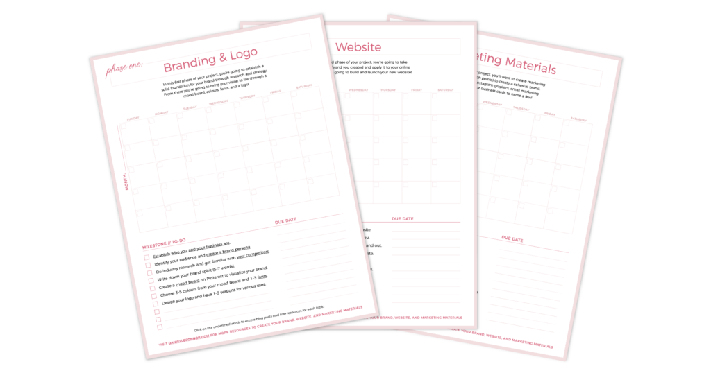
Get your Project Planning Calendar Freebie!
5 Things You Need on Your Website:
1. An easy-to-navigate menu bar
You want to make your user’s experience as easy as pie! (or cake if you prefer cake!) If people can’t find what they’re looking for, they’re going to click away – you only have a few seconds to catch their attention. So, MAKE IT EASY for them to navigate where they want to go.
Tip: Avoid cutesy names for your pages here and stick to the basics like ‘About’, ‘Services’ or ‘Blog’ that are more searchable (try to avoid unique page names such as ‘Our Thoughts’ for your blog).
2. A clear call-to-action above the fold
You’re probably wondering – Danielle where’s ‘above the fold’ on my website?
The fold is the bottom of your screen, so ‘above the fold’ is the first section of your website and the content that fills the screen, before someone starts scrolling down the page. The ‘above the fold’ section is the most important as it’s your opportunity to showcase your business and connect with your ideal clients!
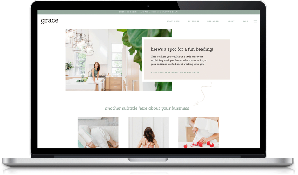
Let’s take a look at my Grace Showit website template, where you can see this section is SUPER clear the second someone lands on the page! The user is able to understand who you are, what you do, and what the next step is (eg. a “start here” button, a “view services” or “book a consult” button). All without having to move their mouse!
3. Clear hierarchy and call-to-actions
I want you to be intentional with how you layout your homepage. Everything is there for a reason, you will see I’ve done this on my Showit website templates which are all ready for you!
Keep your website goals in mind – how does every section serve a purpose and lead your user one step closer towards the end goal? You want to achieve this with clear call-to-actions (CTA’s) throughout.
For example, an about section helps users get to know you better before they choose to work with you. A good about section helps potential clients develop the “Know, Like, Trust” factor. (And, don’t we all want our clients to know, like, and trust us?) 😉
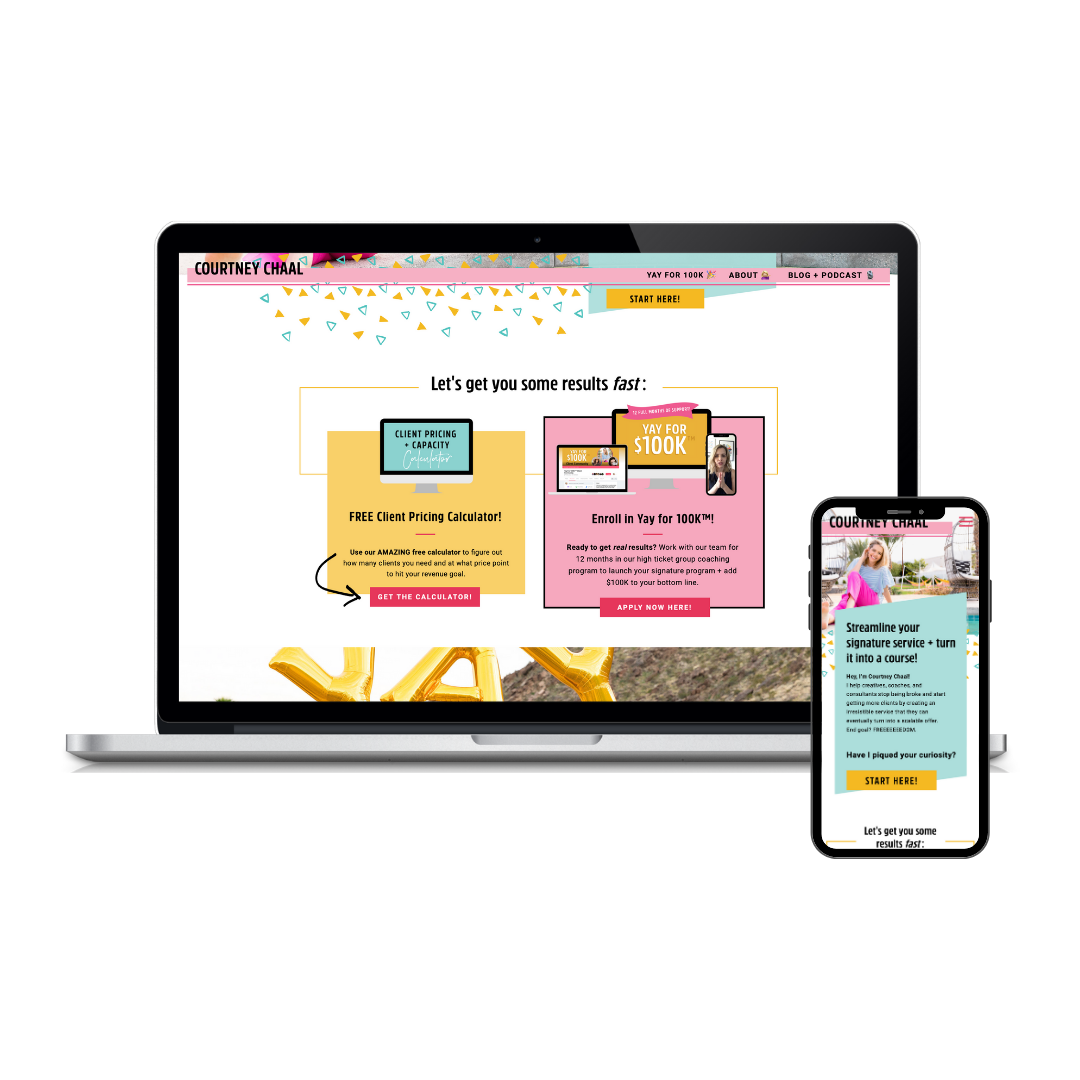
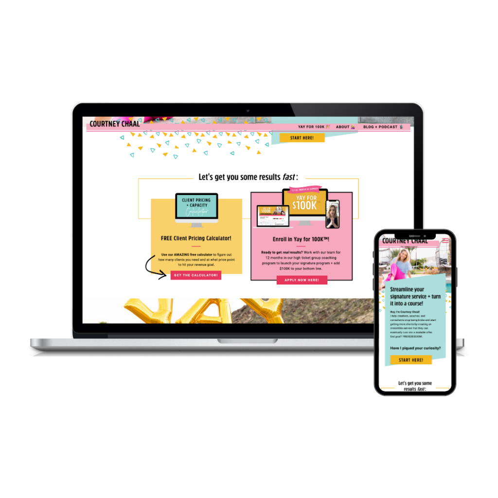
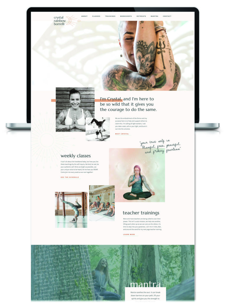
Check out Courtney Chaal’s website (such a fun custom project we worked on together!), it’s a great example of CLEAR CTA’s with big buttons, bold colours and multiple prompts. When designing your CTA’s it’s okay to be bold! You want them to serve their purpose and get your dream clients clicking to learn more and book you!
4. Personality
You want a person to land on your website and “know” you. One of my favourite parts about designing custom websites for my clients is the compliments I get on their website when someone lands on it and they “see” that person immediately. When your friends compliment your website and say “that’s totally you, to a tee!” that means we created a successful website! One that’s unique to you and your business!
Your business isn’t generic, boring or cookie cutter is it? (of course not!) So why have a website that reflects that? Your website should be unique to you and reflects your business’ personality.
Think about what makes you unique, what sparks your joy, or what makes you different? Don’t be afraid to let those unique sides of you shine through your website’s personality!
5.Don’t leave people hanging
We all have that friend, the friend that starts telling an epic story and it fizzles out by the time they get to the end. Don’t be that friend! Don’t leave people hanging!
Finish with a STRONG CTA at the bottom of the page or in the footer of your website. Give the user one last chance to achieve the main goal(s) of your website. Once they reach the end – this is your final opportunity to convert a user into a potential client!
Are you looking for a strong, high-converting, gorgeous website for your business but don’t know where to begin?
Start with one of my Showit website templates and become worry-free in no time! All of my beautiful website templates were intentionally designed to include the five key elements of a successful website – booking you clients and amplifying your success!
Any questions? Send me an email and let’s chat!
XO
Danielle
