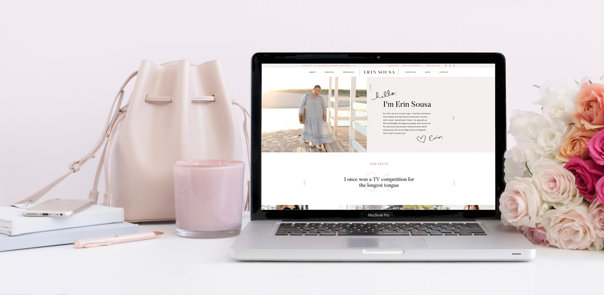
March continues with more tips and tricks to up-level your website and use it to grow your business and drive sales! Today I’m sharing three pages you need on your business (along with a bonus one that’s non-negotiable!).
I’m breaking down what you need on these key website pages, and as always, extra design tips to think about as you’re creating your website!
Let’s break it down:
1 – Homepage
Now before you say “duh, obviously!”, hear me out. Of course you need a homepage for your website, but you don’t want it to go to waste! So many people don’t take advantage of the important space above-the-fold (before people even start scrolling), and don’t give their users clear call-to-actions.
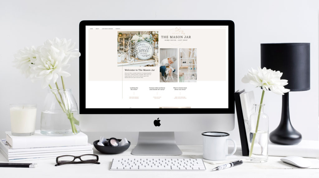
People should be able to know right away who you are, what you do, and what you offer when they land on your homepage. Do not leave them guessing! Otherwise guess what? They’re going to leave your website and you’re going to lose a potential client or customer. Easy as that!
So how do you create a successful homepage?
- Make sure you have a call-to-action above-the-fold. Whether that’s “see my services”, “join my Facebook group”, “book a free consult”, make it clear to your users where you’d like them to go next.
- Create hierarchy across your homepage. Make it easy for users to scroll and scan the page to find what they’re looking for.
Looking for more website design tips?
Get my FREE Top 5 Website Design Tips!
2 – About Page
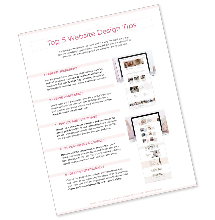
I want to know who you are! How are you going to build that know, like, trust factor and connect with your audience if they don’t know who they’re connecting with? Your about page is where you start to build those relationships with your audience.
I can tell pretty quickly from an about page whether I’d “click” with that person or not – make sure to take advantage of this space on your website and help users get to know you and want to book your services!
Bonus tip:
Tell me your name! Especially if your business name isn’t your actual name. I’ve seen so many About pages that tell me about the business owner, have a photo, but they don’t actually introduce themselves!
Even better?
Share a few fun facts about yourself and showcase your personality! Add some fun, personal touches like a handwritten sign-off, icons, playful photos, whatever speaks to your brand identity!
3 – Services/Offerings Page
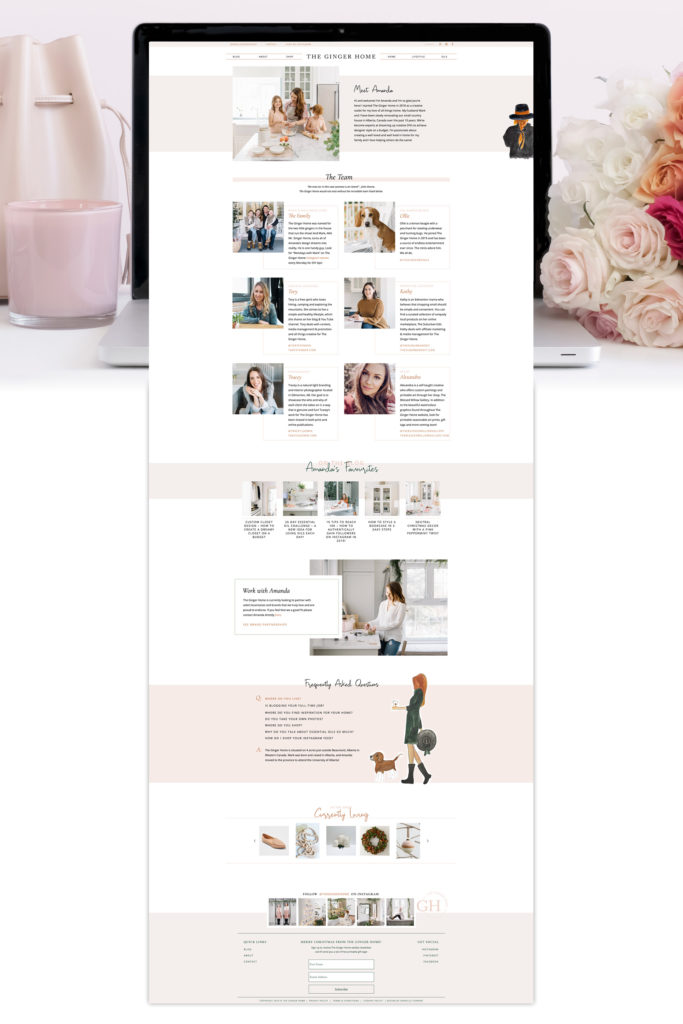
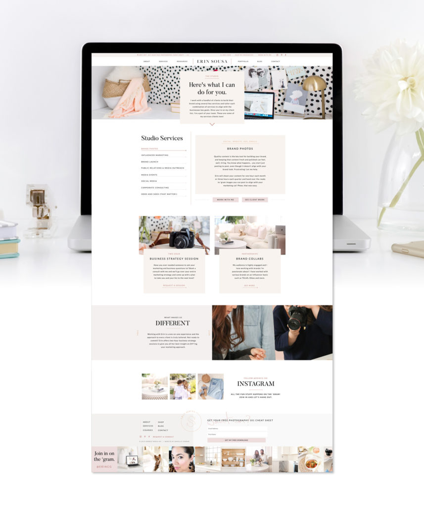
Now that you’ve engaged your audience and they know who you are, you need to share how you can help them! Whether it’s the services you offer, products that you sell, you want to help them and make it easy for you to do so!
Break it down, ask yourself:
- What packages do you offer? Categories of products?
- Who are you serving?
- What problems are you solving and how?
- Is it easy for people to book a consultation or learn more if they need to?
- Do you have your prices clearly listed and visible?
These are all important pieces of information to work into your website and make a priority as you create and design your pages.
Check out Erin’s website for a great example of a Services page:
Bonus: Contact page
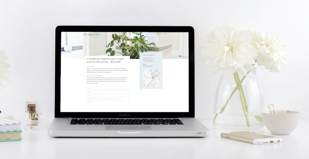
So this last page is a bonus (it’s the fourth one), but it’s super important!! Now it’s a bonus because I want you to have ways for people to reach out to you throughout your website – a link to “book a consult” on your homepage, “ask questions” on your services page, “say hello” on your contact page”, an email link in your footer. But you should also have a page with a contact form where it’s really easy and intuitive for people to reach out to you.
I have all those links throughout my site and I still get people who inquire about projects through my contact page form – which is totally fine! You want to make it easy for your potential clients and customers to reach out to you.
Because like I’ve been repeating over and over, what happens if you don’t make it easy?
They are going to leave. You can wave goodbye to that could-have-been-a-dream-client!
It doesn’t need to be anything super fancy, just the basics! Stick to your brand identity so your contact page is consistent and cohesive with the rest of your site; add a photo; a short intro; and be sure to TEST your form! Takes two seconds and you want to be sure you have a form that works!
As you create your website, don’t forget to join my FREE Build Your Brand Squad Facebook group where you can share your work, get feedback on it, and learn more every “website Wednesday” where I share bonus tips!
Come join the group and share your favorite page from your website! Tell me why it works for your business and which tips from above you implemented (or if you’re struggling with any specific page and have questions)! See you there!
XO
Danielle
