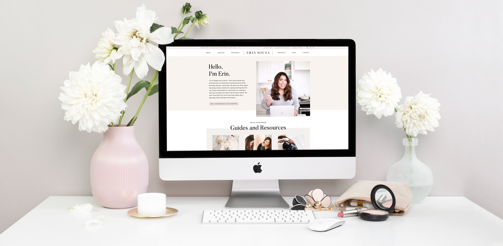
You know those full circle moments that make you appreciate how far you’ve come in your business? That’s what this project was for me!
If you had have told me nearly three years ago, when I was sitting in Erin’s marketing workshop, that I would one day work with her to rebrand and create her new website – I wouldn’t have believed you!
I’ve always been a huge fan of Erin’s, so it was a dream come true when we began working together, and then even more so when she asked me to help her with her new brand and website!
Erin was looking to update her brand, as she had outgrown her previous brand and website. She wanted something modern, creative, and authentic, while showcasing the work she does – building brands and educating others about doing the same.
We created a complete brand – including a mood board, colours, fonts, logos – and a new website on Showit! Here’s a behind-the-scenes breakdown of the project, some before-and-afters, and some of my favourite elements throughout!
Erin’s Brand & Website Goals:
- A modern, creative brand that speaks to her personality as an entrepreneur and creative business.
- An engaging website that connects with her audience while providing value and education about brand building.
- A website that showcases client work, testimonials, and services in a new and playful way.
Erin’s Brand + Logo
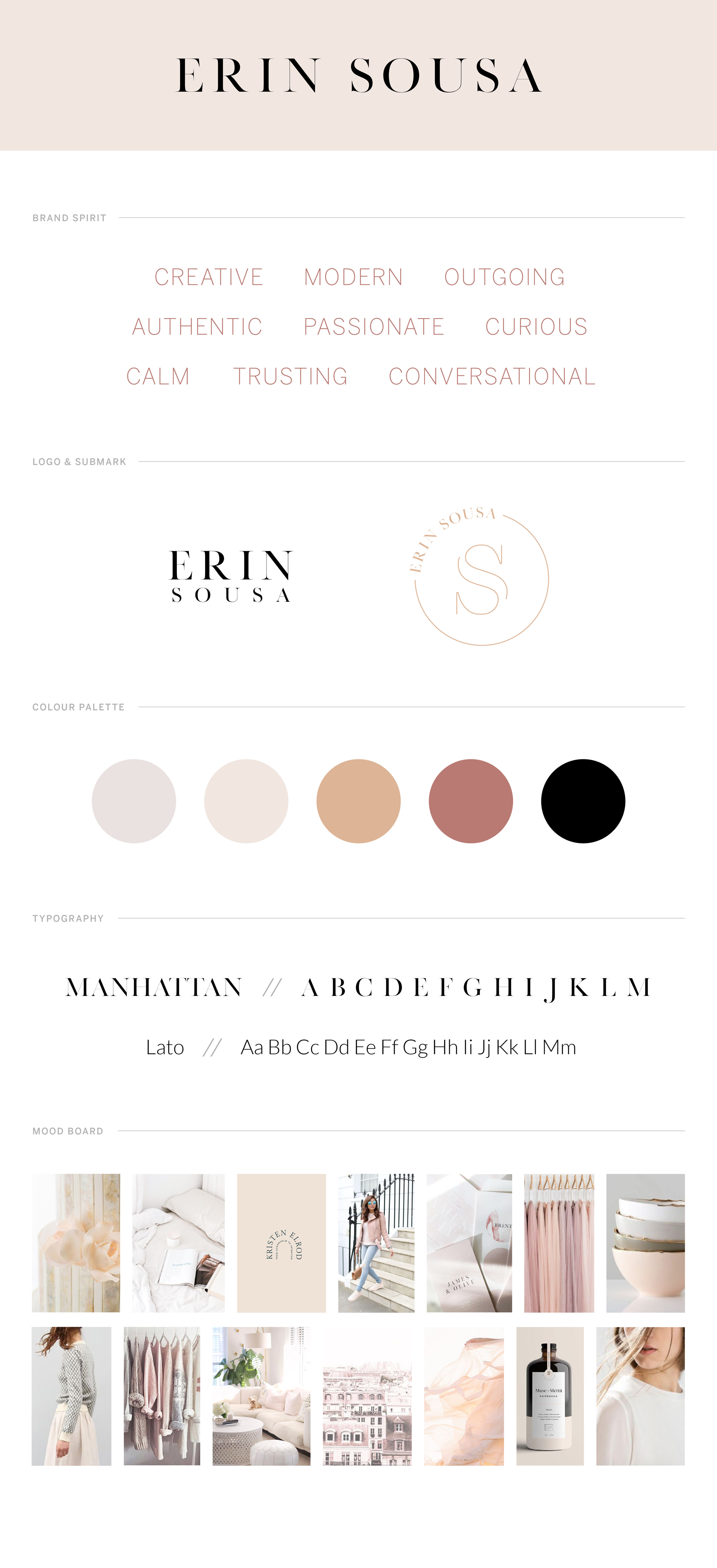
Modern, authentic, and creative were a few of the words that kicked off Erin’s brand development and then became part of her brand spirit and personality. We used these to create her mood board – pulling images that had a calm, soft, and feminine feel – and curate the rest of her brand elements.
For the colours, we went with a more muted, neutral palette. We wanted to channel that sophisticated, modern vibe. These colours then translated into subtle backgrounds across her website, with muted pops of colour for text elements.
The font is a sleek serif, which speaks to a higher-end brand, although we balanced it nicely with Erin’s actual handwriting in areas of her website. I love the juxtaposition of the two, showcasing Erin’s personality perfectly!
I created three logo options for Erin, to be used strategically across her brand. We have her main logo (her full name), to be used in instances like her website header, stationary, worksheets. Then a second, stacked version of Erin Sousa, to be used where the full one may not fit. Lastly, and one of my favourites, is Erin’s circular logo with the ‘S’ outline. We used this logo in her footer and as a playful accent across marketing materials.
I love how Erin’s brand came together to speak to her brand spirit, personality, and mood board. It truly represents Erin as a creative entrepreneur, brand, and business. Based on the feedback after her initial launch, it was also a hit with her audience, who felt the same!
Erin’s Website
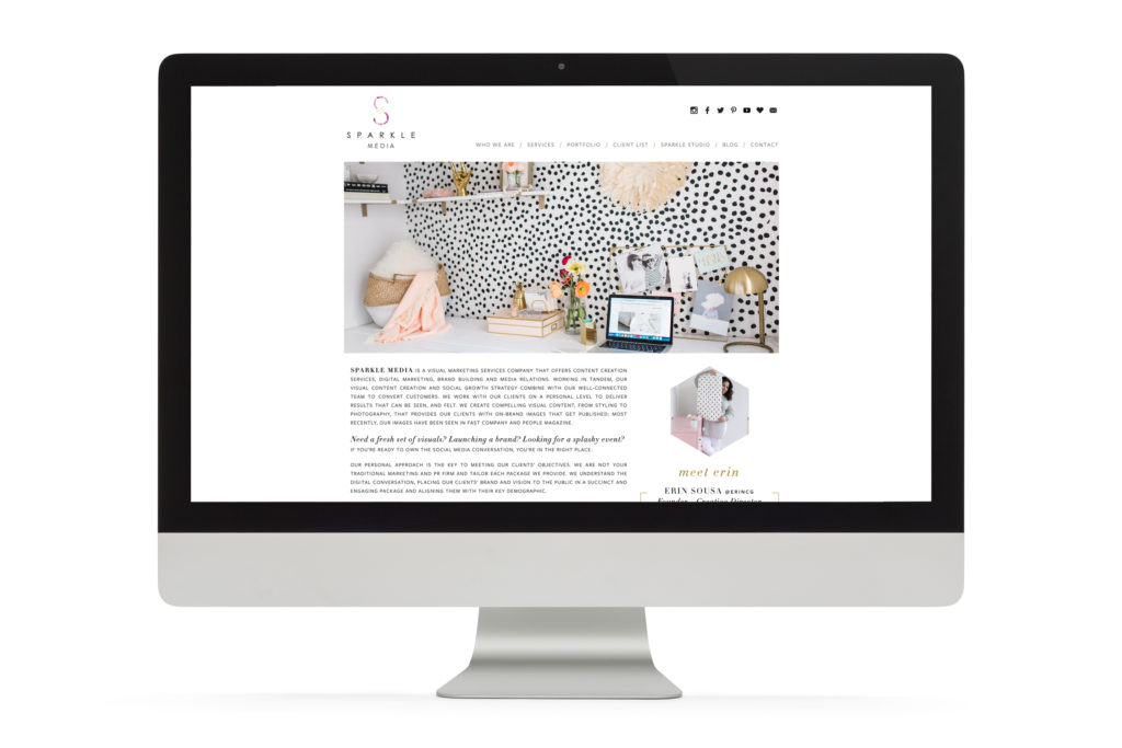
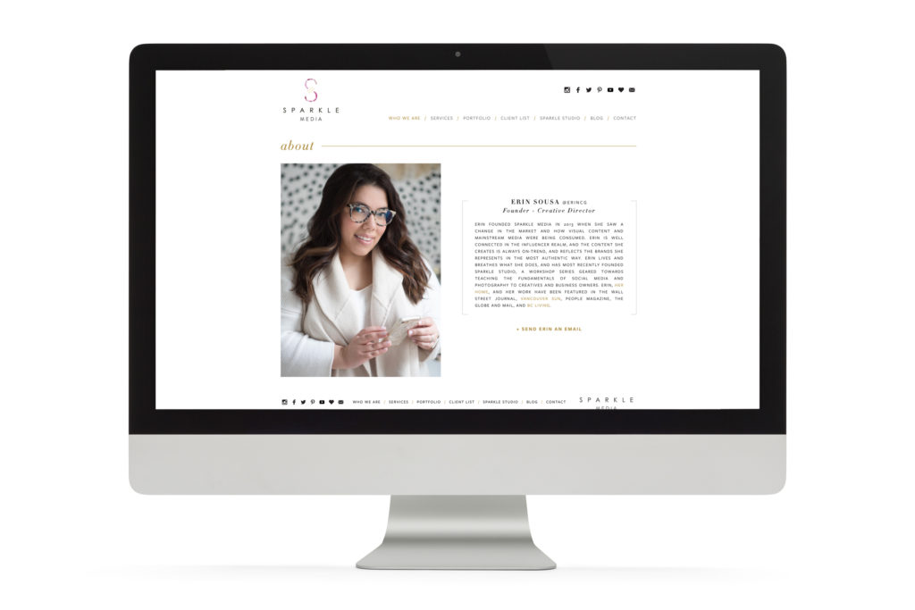
Erin’s old website was quite simple, and while simple isn’t necessarily bad, it wasn’t connecting with her audience in a way that we knew she could. Her personality wasn’t shining through any eye-catching elements, and the website wasn’t encouraging users to spend any significant time on it.
These were some of the main user experience challenges we wanted to address – through interactive elements and sections users could click through and explore further, to encourage users to visit other pages of the website and engage with call-to-actions.
The Before:
The After:
I couldn’t be more thrilled about how this website turned out! It was so much fun to get to create Erin’s new site on Showit (my first website on this platform). I had all the creative freedom as a designer to really bring Erin’s vision to life, and not feel limited by the capabilities of other website platforms!
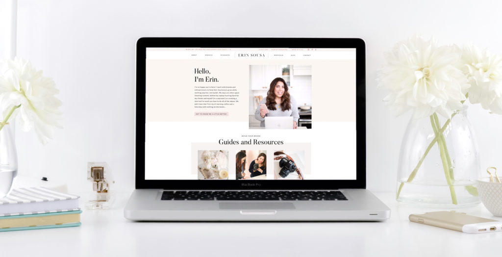
There are my three favourite elements of the website, and the ones I feel make it as successful as it is:
1. All the interactive and clickable sections!
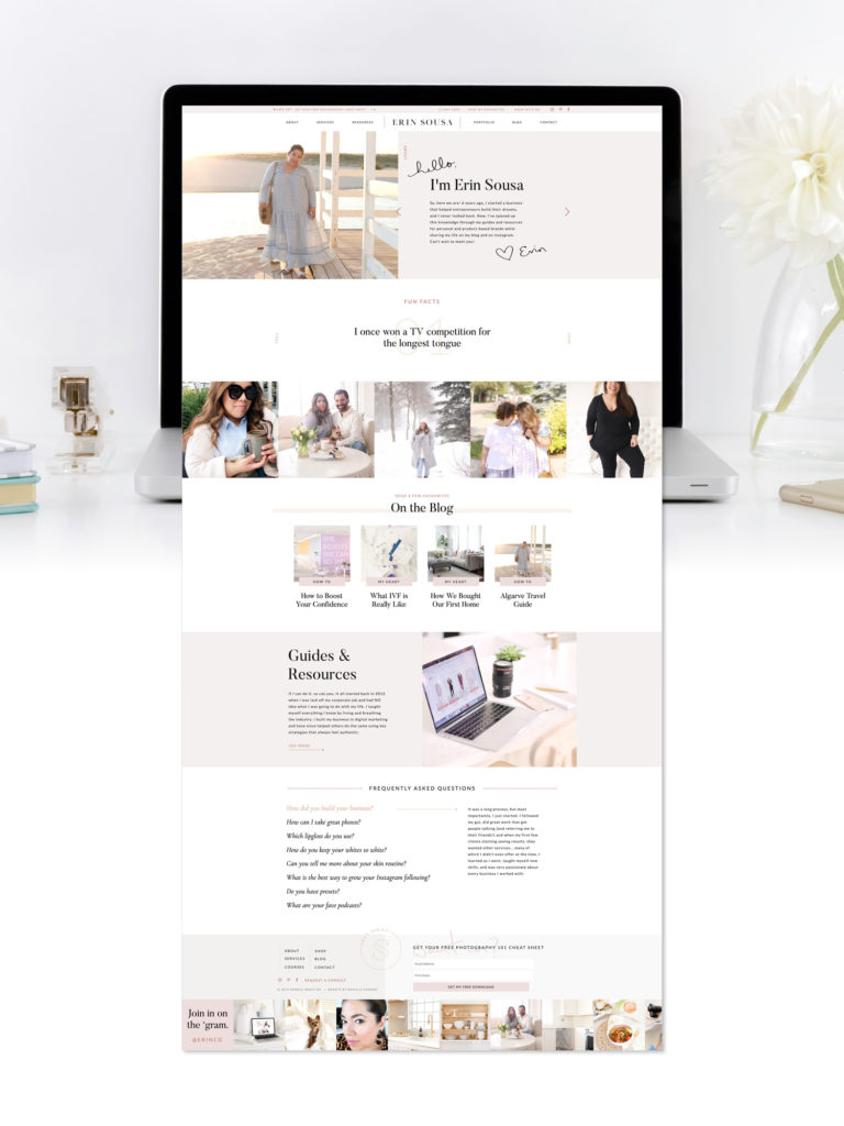
As I mentioned, this was my first website on Showit, and I loved getting to create such interactive sections for users to explore and play with! It was SO FUN not to feel limited in terms of what I could create! For example, on Erin’s About page, we have three sections that users can click through – the main banner to learn more, all the fun facts, and the beautiful FAQ section at the bottom!
2. The handwritten text that adds a personal, playful touch!
I had Erin write these on my iPad, and then I vectorized them and incorporated them into her website design! They were the perfect way to add something unique and different, and another way to highlight Erin’s personality! We used these across the entire site – in the footer, and the portfolio, client love, and resources pages!
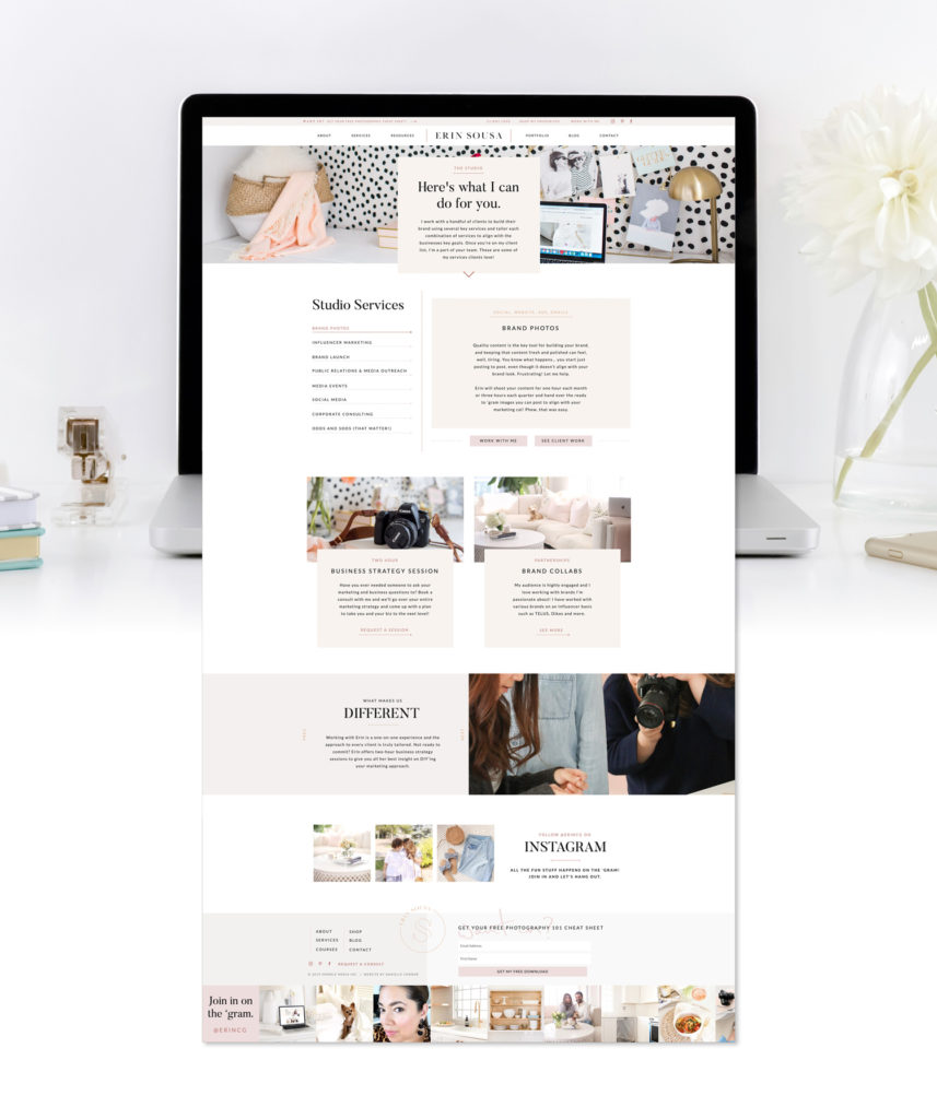
3. New and oh-so-creative design solutions!
In both the services and portfolio pages, I had so much fun thinking of new, creative ways to showcase Erin’s work. In the services page we were able to highlight all of Erin’s offerings without the classic, super-long scrolling page. Then in her portfolio, we’re able to show more details and images for each project without loading an entirely new page.
“I’ve loved working with Danielle! She’s so easy to work with, taking direction and using her creativity while really drawing out a vision that you didn’t know you even had! She works hard to take the burden of a project off your shoulders so you feel supported, she communicates clearly and never misses a deadline. I’d highly recommend hiring Danielle!”
– Erin Sousa
Needless to say, I love how Erin’s new brand and website came together, and most importantly – so does she!
I’m now working on another handful of Showit sites for my clients (follow me on Instagram for some sneak peeks!), and want in on a little secret? I’m going to be creating Showit website templates too! But shhh, that’s just between you and me for now, so stay tuned for that! 😉
What do you love most about Erin’s website? Let me know in the comments below!
XO
Danielle
