
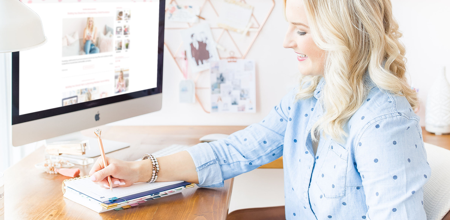
Once you have your solid foundation established (if you haven’t read part two of this series, you can check it out here!), you’re ready to create your visual identity!
Your visual identity is your brand spirit and personality, mood board, colours, fonts, and logos. This is what I create for my clients in their brand guide – which encompasses all of the above, and is a great brand tool that we then use to create their website and marketing materials.
Having a strong visual identity is going to help you make sure your brand is consistent and cohesive across all of your touch points (a little hint of what the final part of this Building Your Brand series will be!).
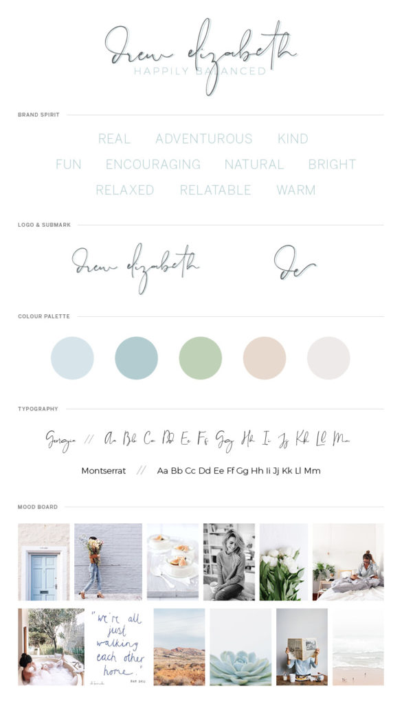
This is Drew’s brand guide – with her brand spirit, mood board, colours, fonts, and logos!
Let’s walk through the different areas of your visual identity, and the important role each one of them plays:
Brand Spirit & Personality
Your brand’s spirit and personality are the key words that evoke emotion, trigger certain thoughts and feelings, and speak to your business’ core values. For example, mine are “feminine, connection, and fun”, but yours could be anything – any kinds of words, adjectives, verbs.
It’s important to establish this first because this will influence the rest of your visual identity, especially as you create your mood board and start to bring your brand to life.
Q: Is your brand’s spirit and personality speaking to and connecting with your audience?
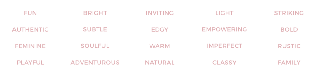
Above are some example brand spirit words to get you started.
Mood Board
I know we all love looking at a gorgeous mood board, but they’re more than just a pretty set of pictures! Your mood board is what you’re going to use to pull colours from, fonts, photography style, and so much more.
It’s important to use this tool to bring to life the look and feel of your brand, and pull together what you’re envisioning. You want your mood board to portray your brand’s spirit and personality.
Q: If someone’s looking at your mood board and has to think of three words to describe it, do those three words align with your brand spirit and personality?
Erin Sousa’s Mood Board (check out Erin’s website that we built based off her mood board!)
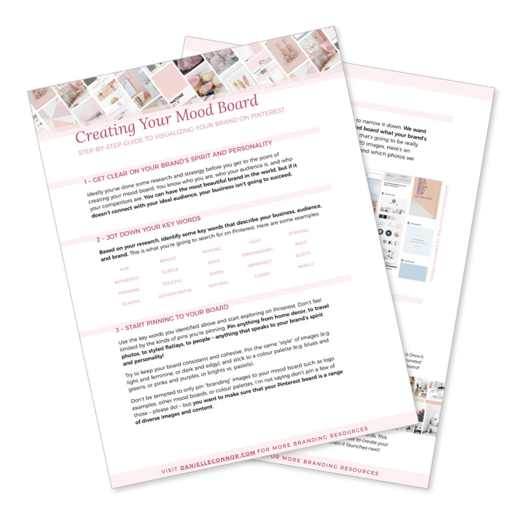
Start building your brands visual identity today!
with this easy to use guide you re steps away from a rockstar brand and branding moodboard!
Colours
Colours are powerful tools that you can use to evoke emotions and connect with your audience. A bright, fiery red can get people energized and excited, whereas a calm, peaceful blue can put someone at ease.
Don’t underestimate the power that colours can have on your visual identity! A soft array of pastels will speak to a very different brand personality than a group of intense neon colours. Use this to your advantage to further develop your brand and connect with your audience.
Q: What emotions do your colours evoke? Are those the emotions you want them to?
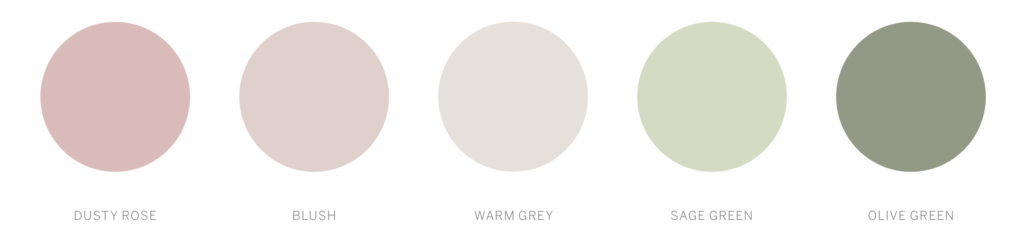
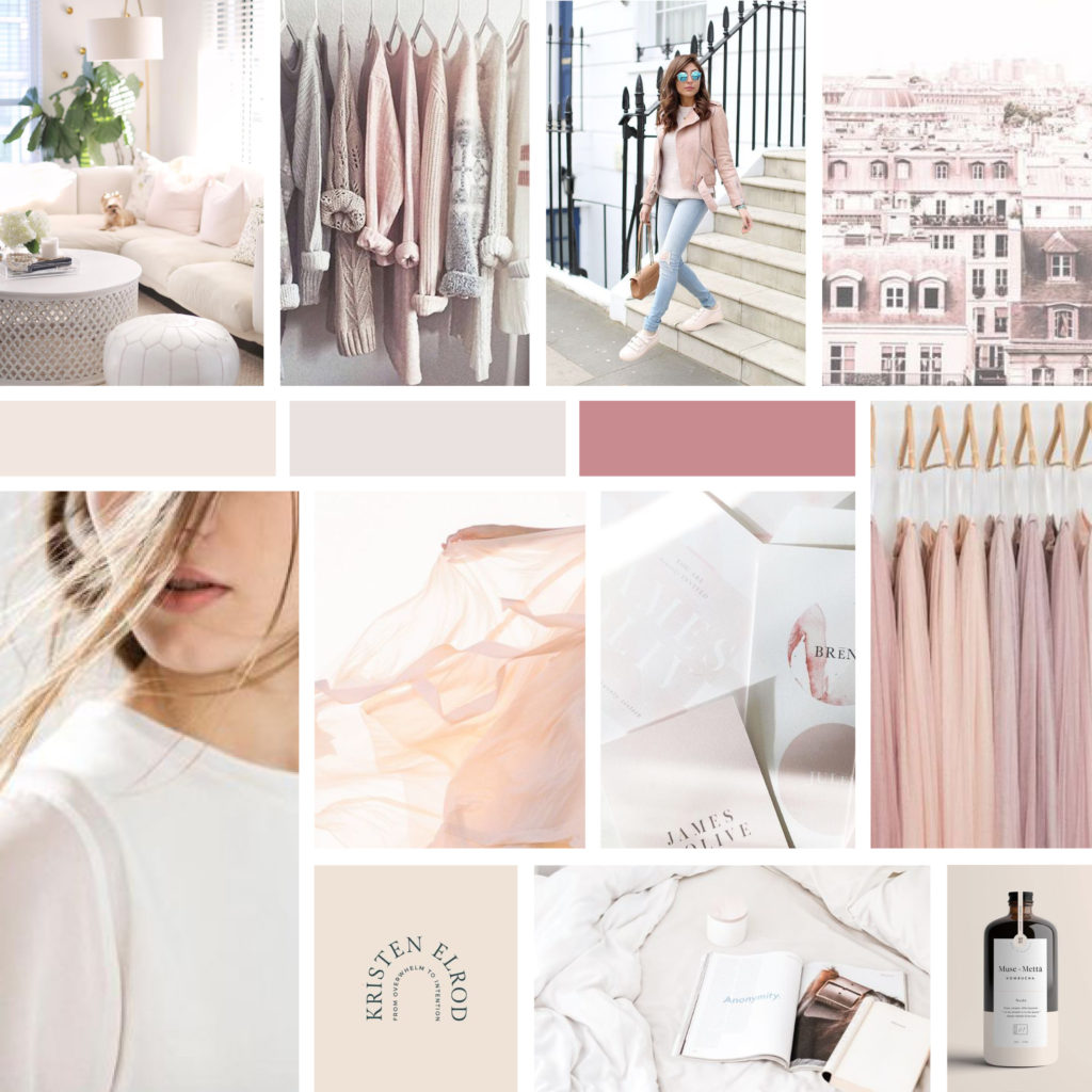
These are Codi’s brand colours – I shared her mood board in the last Building Your Brand post!
Fonts
I love playing with fonts, and just like colours, fonts can evoke some pretty stong personalities and emotions! A delicate, smooth script font is very different than a thick, rough, edgy brush script, even though they’re both scripts. When you’re looking at all the fonts that you have at your fingertips, whichever one you pick will have a huge impact on your overall brand.
Different fonts are going to connect with people in different ways, so be intentional when choosing fonts for your brand. Understand the style, look, emotions, and make sure it aligns with your visual identity.
(One of the bonuses in my Blissfully Branded course is my top-ten foolproof font pairings! If you want to be the first to know when it launches again, get on the list!)
Q: What personality would you associate with your chosen fonts? Does it speak to your brand spirit and personality?
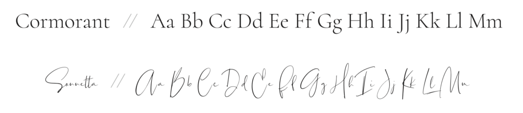
Here’s an example of a recent font pairing for a client project. These fonts are sophisticated, feminine, playful, and classic.
Logos
I’ll talk about logos in another blog post, as there’s so much that goes into a logo. It’s just too much to include in a few sentences. I will say that while logos are important, they aren’t your whole brand. Everything above that I’ve mentioned plays just as big of a role (bigger when you combine all four!) than your logo. So please don’t get caught up in needing a logo when you haven’t established a solid foundation (revisit Part One!) or created all of the above brand elements!
I hope you have so much fun creating your brand! Be sure to grab my free guide below on creating your own mood board on Pinterest! It’ll help set you up for success when creating the rest of your visual identity!
Any questions? Let me know below in the comments!
And stay tuned for the next (and final) Building Your Brand post, where I’ll be sharing the 10 touch points you can use to up-level your brand!
XO
Danielle